The World Surf League (WSL) is the international governing body of professional surfing. It’s come a long way since it was known as the ASP (Association of Surfing Professionals) and in the beginning, the IPS (International Professional Surfers), founded in 1976.

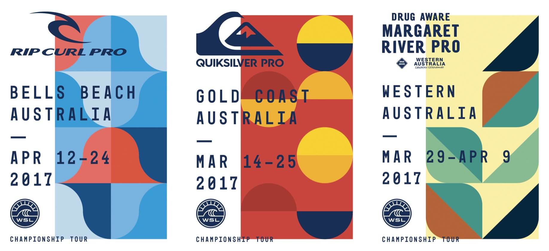
The WSL went through a huge shake-up and re-brand in 2015, and has been going from strength to strength ever since. What’s caught our eye — we’re biased — has been the graphic design and visuals, featuring beautiful typography, quirky compositions, and stunning visuals.
Surfing events have a long history of producing stunning artwork, often incorporating surf art. For example: take a look at the Roxy Jam Biarritz or the Reef Hawaiian Pro. We did a little research, and found the work of Jason Penning, a Creative Director at WSL, and wanted to share some of the beautiful work he and the WSL creative team have been doing.
By Nature
The short videos below are from WSL’s “By Nature” campaign, celebrating professional surfer’s “inherent nature that drives them to be fearless, stylish, defiant, bold, iconic, and limitless as they push to redefine the sport”. Each video “is focused on individualizing each athlete through powerful portrait visuals, dynamic surfing, and their own words that define their very nature”.

2018 world title race
The WSL Awards

Billabong Pro Tahiti
I love Jason and the WSL’s creative take on promoting the Billabong Pro Tahiti (Teahupo’o) event. In Jason’s words, they “released a horror film like trailer teasing the monstrous wave”. By ‘leveraging sensationalism’ the WSL attract new fans and foster excitement about the event (fans can stream live on the WSL website).

We’re always on the lookout for interesting surf culture projects like this. If you see anything, let us know on Instagram or Twitter.
Curated by Andrew Couldwell on Jun 1, 2019

