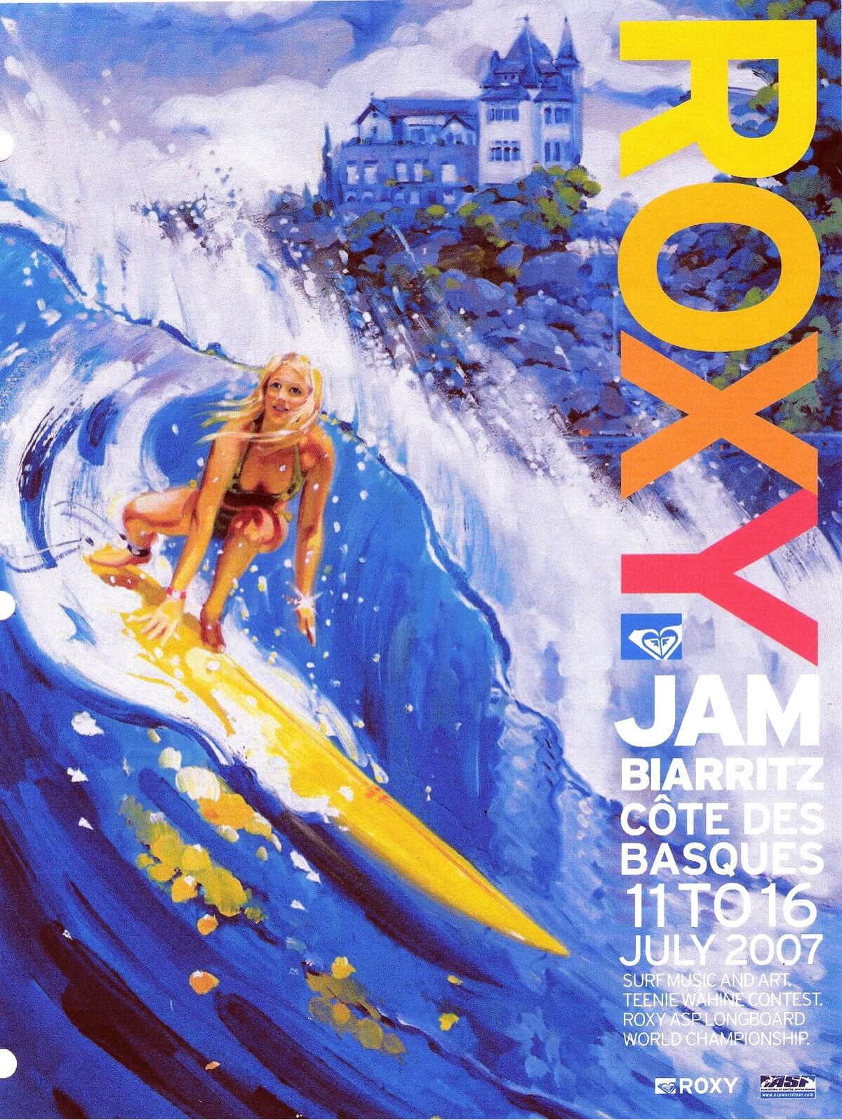
This tutorial features artist, Ron Croci’s latest commission by Roxy for the 2007 Roxy Jam in Côte des Basques, Biarritz, France. This tutorial contains insight into the many steps to create this particular piece of art.

RC: The goal of this demonstration is not to say there is only one way to paint, but to show how I approach my art, and what steps I take to accomplish a unique set of goals. All artists need to create their own individual, signature styles, however, the technique demonstrated here is very useful in the exploration of any specific practice.
Know your subject matter
I would like to begin with a few notes on some things I have noticed with many surf artists, especially those with less experience. Often, I observe that artists are merely copying photographs and not really studying the objects in their paintings.
No matter how ‘loose’, or ‘tight’ a style is, there are basic laws of nature, and construction of objects, that must be understood in order to create excitement in the viewer. Often this term ‘looseness’, is simply an excuse to dumb down photographs. To an expert on the subject, this lack of observation makes the art lack conviction.
Take your time. See how the ropes on a canoe are placed, what the real curve on a surfboard is. How does a bathing suit actually hang? How are the fingers spread during a turn? Artists are often impatient and want the enjoyment of the final results very quickly. See John Singer Seargent. No matter how ‘loose’ his creamy forms are, everything is correct. That is why he is one of the greats.
The point is, if you know a thing well enough, you are not ‘faking’. This is especially true for lighting. There are formulas for creating homogeneous lighting arrangements, even in purely imaginative works.
One of the most common errors I see is in the painting of palm trees. Quite often artists think of these trees like a bush on a stalk, and they neglect to add the branch that faces the viewer, this happens because the perspective is difficult, however it creates a tree that is unconvincing. Know your subject matter.

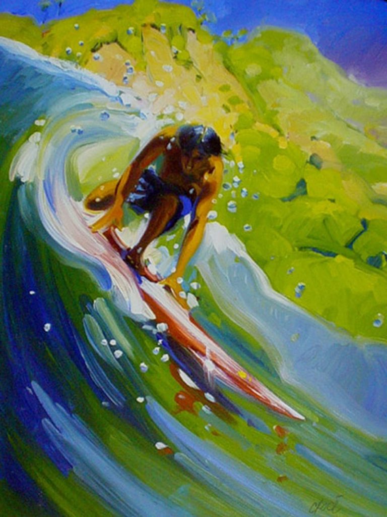
Ready (painting)
My assignment was based on the example I submitted, titled “Ready”.
Pencil studies
Whether a piece of art is a commission or the sole inspiration of the artist, I cannot overestimate the importance of the pencil studies. Exploration of the subject matter is of the utmost importance. I’ll go so far as to say, it’s more important than the final art. They are the very foundation of the house you are building.
Working from the examples I am using, I am attempting to demonstrate my approach on this subject. Some of the artistic greats, such as Andrew Loomis and Norman Rockwell would make as many as 50 thumbnails before their color studies. Remember, if it’s worth painting, it’s worth planning.
What we are after is striking design, if possible. It is so much more important than the subject or material itself.
One requirement of this assignment was to use a location-specific image, which is the house in the background, on the right, plus the wave direction, and color.
I created 5 pencil studies — 3 of which are shown below — to show the Art Director. They were done with a Strathmore #3 pencil on common card stock paper. The surfer is standing, or crouching while preparing for the turn. Also, each one has a tonal variation on the building. The Roxy Art Director chose #1, with the background of #2.

Color comps
What does “color comp” mean? It is a term used to describe a comprehensive study of color possibilities. In this particular exercise, our range of possibilities is limited to the location, and time of day; however, there is a choice of three color groups, based on the three primaries, red, yellow, and blue.
My method is derived from the so-called ‘golden age of illustration’. How I accomplish this is by deciding which one of the three best primaries suits my purpose. In this case, I chose yellow.
I want to use the color which is associated with the main subject, which is the woman surfing. This is how it works. Whichever of the three primaries you choose, mix that color with the other two primaries, so that, in this case, the red, and blue have some yellow mixed in with them, and they become tinted by the chosen primary, thereby lessening their intensity or chroma. Only the yellow is pure, and the eye focuses on that color, and anything painted with the other two are lessened in intensity and do not compete with each other.
In most cases, using two or three primaries together in the same picture destroys the subtlety of color harmony. I chose the yellow because I wanted to have the surfer, especially her face, glow with a golden ‘from here to eternity’ look.
My process was to take the chosen pencil sketch and trace an outline from it. Then make multiple Xerox’s from it. I chose to use Tria colored markers, but any medium will do. The Xerox process is wonderful because different variations are easily obtainable from the basic image. Sunset, fog, rain, front lit, backlit, etc.
The Roxy Art Director chose to combine comps #2 and #3 (images below). I used the background of that combination, and we decided to make a comp from the figure in #1.

Style, surface, and medium
At this point, I would like to discuss the combination of medium, style, and surface. What I am doing here applies to the art I am using for the tutorial, which is oil paint, although the same principle works for acrylic.
Generally speaking, a smooth surface — which is what I used — is good for textural build up with paint, because the paint piles up on the surface. I make my own panels. I like this surface because it works well for me with water sports.
A medium textured surface is good for almost anything. A very rough surface is great for paintings of hard drama subjects, such as buccaneers, convicts, muscular black slaves on 17th-century sugar plantations, etc. This surface really brings out the psychological harshness of the subject matter. Whichever surface you chose, it is best to match it up with the painting’s content, and message.
Now, I like to mix paint thinner for the initial wash, because it dries quickly. I use Poppy Seed Oil for the rest, because it dries so slowly, that each day I come back to work, it is just like I left it the day before. This is great for the “wet on wet” technique I like to use for water sports. Rapidly drying paint mediums look very good on the rough surfaces because the “dry brush” look goes with the pebbly texture.
Please remember here that Toulouse-Lautrec most famous images were painted with turpentine on corrugated cardboard. So, really anything goes. This is just what I do.
Final drawing and transfer
The final drawing is done simply and quickly, as we have already picked the pose. I can easily enlarge, or reduce the drawing to fit the canvas size, using Xerox.
At this point, I want to transfer the image to the working surface. I do it in this manner. First, I like to use a stick of NU-PASTEL. This is a square bar of non-oil chalk of very fine quality. That’s what I use, although, even pencil lead works well. An interesting side note is that this chalk was what commercial artists used for layouts before markers were invented. I love it’s ‘butterfly-wing-powder-like’ quality. I choose blue because the picture is blue, but any color will do.
First, I apply the chalk to the back of a piece of tracing paper. Sometimes I apply it to the back of a Xerox. Now, very important, I rub the chalk into the paper (image #1 below).
Next, I place the paper, chalk side down between the drawing and the painting surface. Then, tape it all together (image #2). I use a ballpoint pen to go over the drawing surface to make a carbon copy image on the painting surface (image #3). This is very light, so, I hope you can see it.

Chalk transfer and blue pencil wash
Let’s make this short. Okay, so, now from the very light image, I go over it to sharpen details and tone. I use a T-Square and Triangle to straighten lines and build correct perspective, on the painting surface.
I draw with a COL-ERASE Blue #20044, although any color or combination of colors will do. This wonderful pencil is water soluble and was developed from studio animation layouts. The blue color disappears on Xerox copies. In essence, the black, final pencil drawing, going over the blue sketch makes it like a tracing, but I digress.
So now all the drawing and shading are on the painting surface. Next, I take a small stiff brush and scrub water onto the water-soluble pencil drawing. The blue dissolves in the proper shaded areas. This process is loose and fast. Add a bit of white Gesso in places, and there is a complete tonal underpainting.

Color palette and rough wash
This step concerns color and the color wash. Let’s start with the palette. I use 6 primaries, three for the light, and three for the shade. The primaries for the light are, Cadmium Yellow Light, Cadmium Red Light, and Cobalt Blue. The primaries for the shadow area’s are Yellow Ocher, Alizarian Crimson, and Ultramarine Blue.
I do not use black. For me, it muddies the colors, especially yellow. A warm or cool black can be made by mixing the Lizarian Crimson, and the Ultramarine Blue.
So, I focus on what aspect of the art I want to emphasize. In this painting, it is the board, and surfer, which are yellow. In any case, one of the three primaries should dominate the other two, this gives harmony, and focus, without having the other two primaries compete with each other.
As you can see I have used yellow to mute the other two primaries, in both the light and shade. Cadmium Yellow Light for the light, and Yellow Ocher for the shadow. If red or blue is to be the key color, then mix some of one of these with the other two, leaving the one primary pure. Do not mix the shadow colors with the light colors, as the entire separation of light and shade will be confused.
Try this excercise:
Draw a ball and put the Cadmium Yellow Light where the light is, and Yellow Ocher where the shadow is–BAM! Instant light and shadow.
Just a note here. To create very good lighting on models or objects using photography. Shine the key light, which can be the sun, wherever you want on the subject, and then shine a reflector, or fill light, directly at the key light, with the subject in between. The fill light should never be more than fifty percent stronger than the key light.
So now I rough in the entire 30″x40″ painting, very loose and broad. I try to let some of the blue wash show through in places (see #1 below).

Final color and varnish
Well, here we are, almost at the end of our creation. As you can see (image #2 above), I just painted over the color wash, very carefully, until the final work was complete. I decided to modify the Cobalt Blue in the pallet a bit with the addition of Thalo Green. Just a little, because this color can be overpowering.
Because of my preparation, I was very familiar with the image, and the art went smoothly, with almost no changes. There is a saying, “completion, not correction” I like this, and keep it in mind because wherever there is an adjustment and correction, this process detracts from the fresh look of the final art. Many people have said to me how quickly it seemed that I created the image, however, as you can see I plan a lot before I lay in those “spontaneous” brush strokes.
So now we are finished. I now email a digital image to the Roxy Art Director, to double check that all is well. By the way, I email all the stages along the way. There is nothing so depressing as to hear an Art Director say “that’s not what I wanted, I didn’t expect that”. I especially hate it when my own inner voice says it.
I use Damar Varnish for oil paints. The instructions say to wait 6 months, but who can do that? As soon as it’s dry to the touch, I varnish. Some hints here. Heat the varnish in the microwave for a minute to warm it up. Put the art in the sun or warm it with a blow drier. This warms the varnish and paint surface so that the varnish flows smoothly. The principle of ‘the coefficient of expansion’ states that when different layers dry at different times, cracking will occur. This hasn’t happened to me.
I use it undiluted, out of the bottle, and paint it on with the design of the painting, not in a grid pattern like the instructions say. This whole warming, and spreading goes for bottle, or spray can.
Do not try to smooth it out by going over it too much, as this may melt the paint. Damar dries quickly and adheres in an almost shrink wrap like fashion. It’s beautiful, but the high gloss makes for some photographic problems. After about a month the gloss subsides to a more acceptable sheen.
Type layout
After the final art was complete and delivered, a 4″x5″ transparency, and a high-resolution digital image was made. From this, the Roxy design team make up the typeface and copy placement. The Roxy typeface is set already. Below are some of the variations they tried:


Bonus art
The client liked the art so much, that they commissioned me to do a second, smaller version to hang in the office of the CEO of Quiksilver Europe, in France. This was a very enjoyable assignment because after all the studying to finish the final artwork, I knew and practiced the whole process inside and out. This painting went so smoothly, it was like connecting all the moves on a 200-yard wave.
Closing chat
Let me close by saying that ‘surf art‘ is more than just the perfect point wave with a palm tree. Everyone’s experience with the sport has its own personal point of view. Look for what YOU have seen and develop, not only a signature style, but also a signature subject matter, and approach. It’s very important to practice drawing heads all you can, and the beach is full of them. So many effects of light and nature are fleeting, and we must sketch constantly. The camera cannot supplant the vivid mental impression one needs to produce a good picture. By actually coming to grips with your subject, you become filled with excitement over what the subject contains.
Since the art I have chosen to use for my example is also commercial, let me say that art buyers, as a rule, are not artists, and it is up to the artist to sell their knowledge and good taste wherever possible. You can give the buyer what they want, and still be giving them what they should have.
Surf art is wonderful, because together, beginner, or veteran, we have formed a real movement. In most of art history, the beautiful marine art’s subject matter was waves on rocks, ships and the fishery, but now we have added the surfable wave and modern beach life to the genre. In my opinion, a milestone in public perception. Surf art try’s to reproduce and shine a light on the beautiful. This art of men and women surfing, and all the surrounding environment, and events have elevated the standards of beauty. We seek an audience for our way of expression, so let’s make what we have to say, worthwhile.
Curated by Ron Croci on Jul 15, 2007

