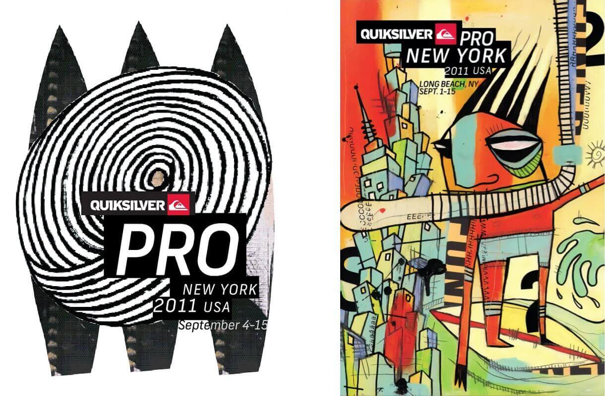
The 2011 Quiksilver Pro New York was the first-ever Championship Tour event on the east coast of the United States, boasting an unprecedented one million dollars prize purse. To mark the grandeur of the occasion, Quiksilver turned to world-renowned graphic designer, David Carson to work on creative concepts for the event.
To achieve a broad range of concepts, David collaborated with New York based artists, George Bates, Justin Kauffmann, and Michael Lotenero.
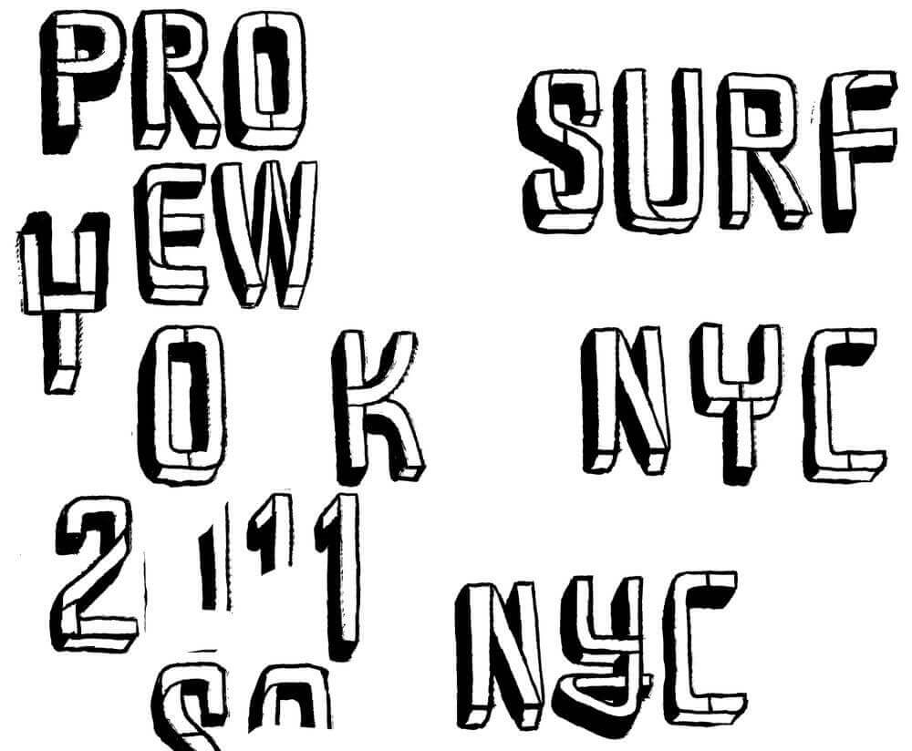
Exhibited throughout this feature are the concepts, typographic explorations, art, illustrations, and designs that David Carson presented to Quiksilver. You’ll see how David dissected assets like the hand-lettered type created by George Bates, art from all three of the artists, and photos of surfers and the event location — experimenting with different layouts.
Of course, as with any creative project, not everything was used, but it all contributed to the end product(s).
The brief
David Carson (DC): The brief was to come up with an original look and feel for the Quiksilver Pro New York surf contest. It was a big deal, as something of this scale had never been attempted for a pro surfing contest. The brief was left very open, other than to say they were currently using “stains and textures” in their ads.
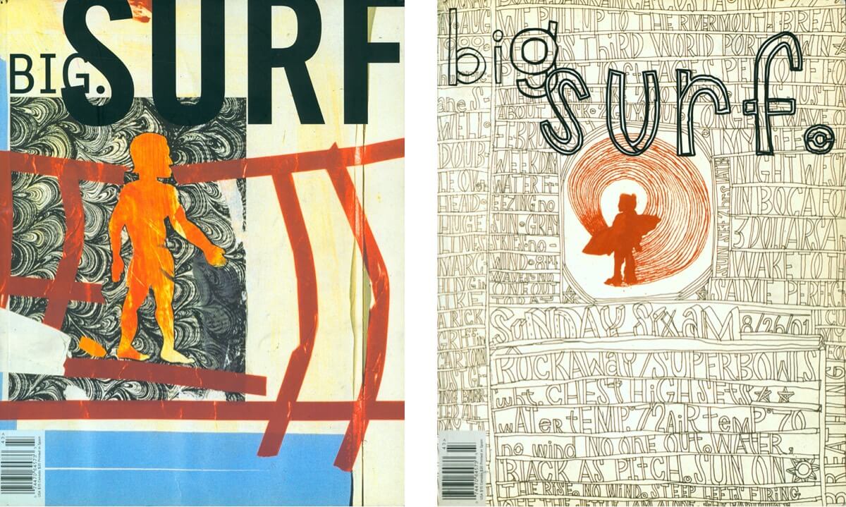
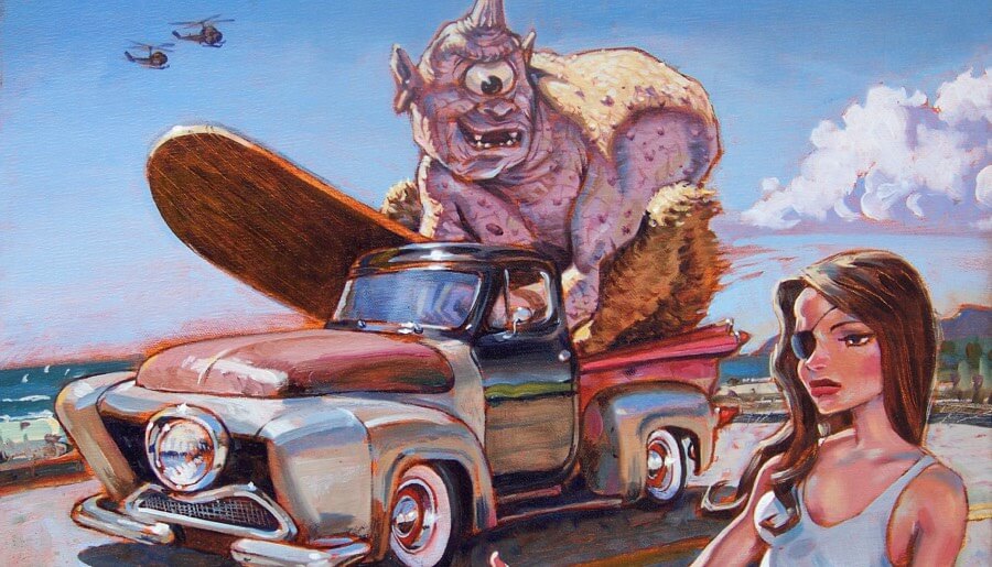
I knew I wanted to use art and not only rely on photography. Having been a huge fan of George Bates‘ work for years, and the stuff we did together for BIG magazine (pictured above) — he was my first choice. I really didn’t have much to give him, so we worked on the actual words and some photos I had of a Quiksilver team rider, Dane Reynolds.
George just kept sending me stuff and I kept tearing it apart and using what he sent as new design elements. I ended up presenting over 100 ideas to Quiksilver, most of it involving George’s art in one way or another. Both George and I being surfers helped a lot. It was a great project, and the Quiksilver people were great to work with.
Two top Quiksilver folks told me it was “the best presentation of work they ever saw” presented at Quiksilver.
David Carson
New York to France
DC: The head of the Quiksilver Pro in France saw the NYC work and immediately contacted me to see if I was interested in working on his project. Helloooooo. I jumped. He told me the only requirement was that it beat the work I had done for NYC! There is a nice little rivalry between the different Quiksilver headquarters around the world.
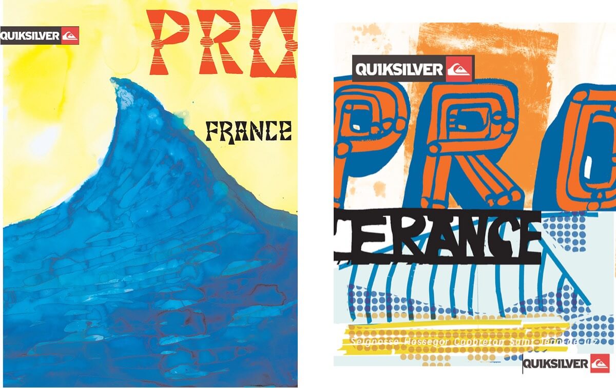
So George and I basically started up again — he sending me letters and words and me mucking with them and adding them to different photos or art. Artists, Justin Kauffmann and Michael Lotenero also contributed to the presentations. The NYC approach was very gritty. The French wanted something more in the tradition of old paintings from the Biarritz area.

Working with George Bates
DC: George was amazing to work with — so many solutions and variations. We both went a little crazy I think, but it was certainly a labor of love, and we were both stoked to be working with Quiksilver on such huge projects. Ultimately, very little of the work we did for NYC was used — for reasons I’m still not totally clear on — but for France, George’s painting and type is all over that event!
Working with David Carson
George Bates (GB): I think the results are pretty cool. Inspiring stuff! I was mostly in the dark about the specifics and scope of the project, which was actually really refreshing after just finishing a few projects that had very specific and narrow parameters.
David gave me a very minimal brief and had some specific requests in terms of text needed and overarching themes (e.g. surf NYC, surf France, beach breaks, perfect A-frames, etc), but most of it was just sending him experiments and playing with type treatments, then David put his transformative magic on it, similar to the last time we worked together on the BIG magazine surf issue (pictured earlier).
I find these [Quiksilver Pro] designs to be really inspiring, with such fresh and unexpected incorporation of the images and text. I just love the stuff David did. Really cool and impactful.
Location, location
GB: The NYC stuff was a no brainer as New York is where I surf/live and the energy of the place and a lifetime of surfing was easy to filter into the work. The French stuff took a bit more research and a “dreaming of destination” sort of process. In the end, we wound up doing a traditional painting for the French pro event and it was another inspiring and unexpected turn as the direction wound up moving toward old travel posters from the region. It’s really cool!
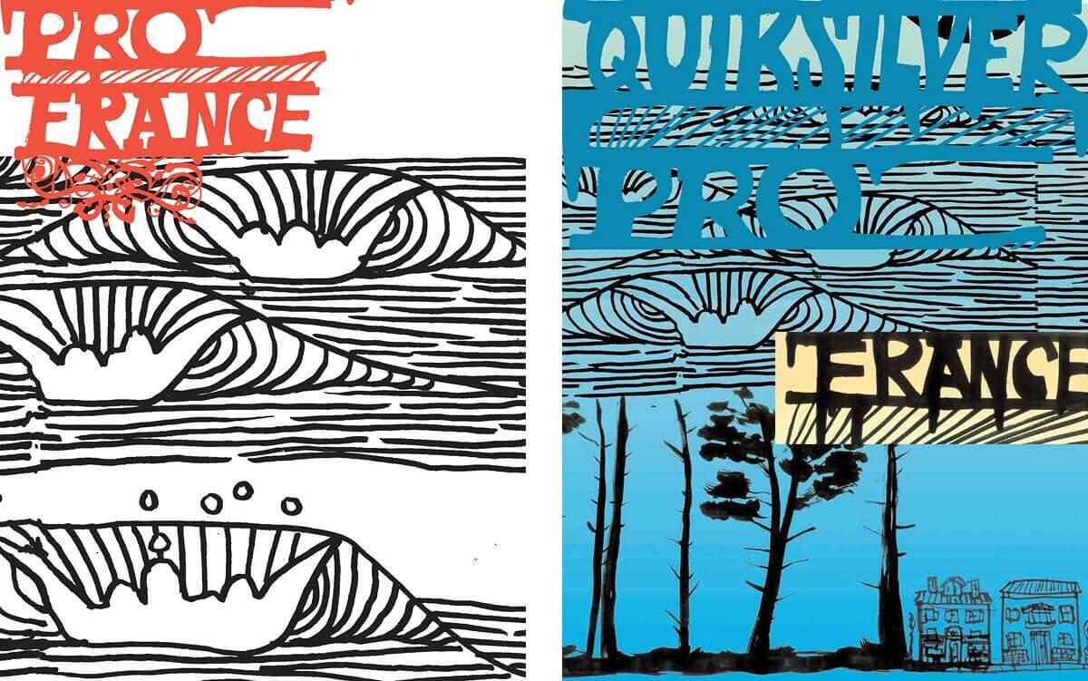
It’s funny, I had to ask someone to show me exactly where the Spanish mountains would end on the horizon and the proper direction of the waves for the final painting! I can’t wait to travel to the region someday and see how closely it lives up to my dreaming, painting, and drawing of it.
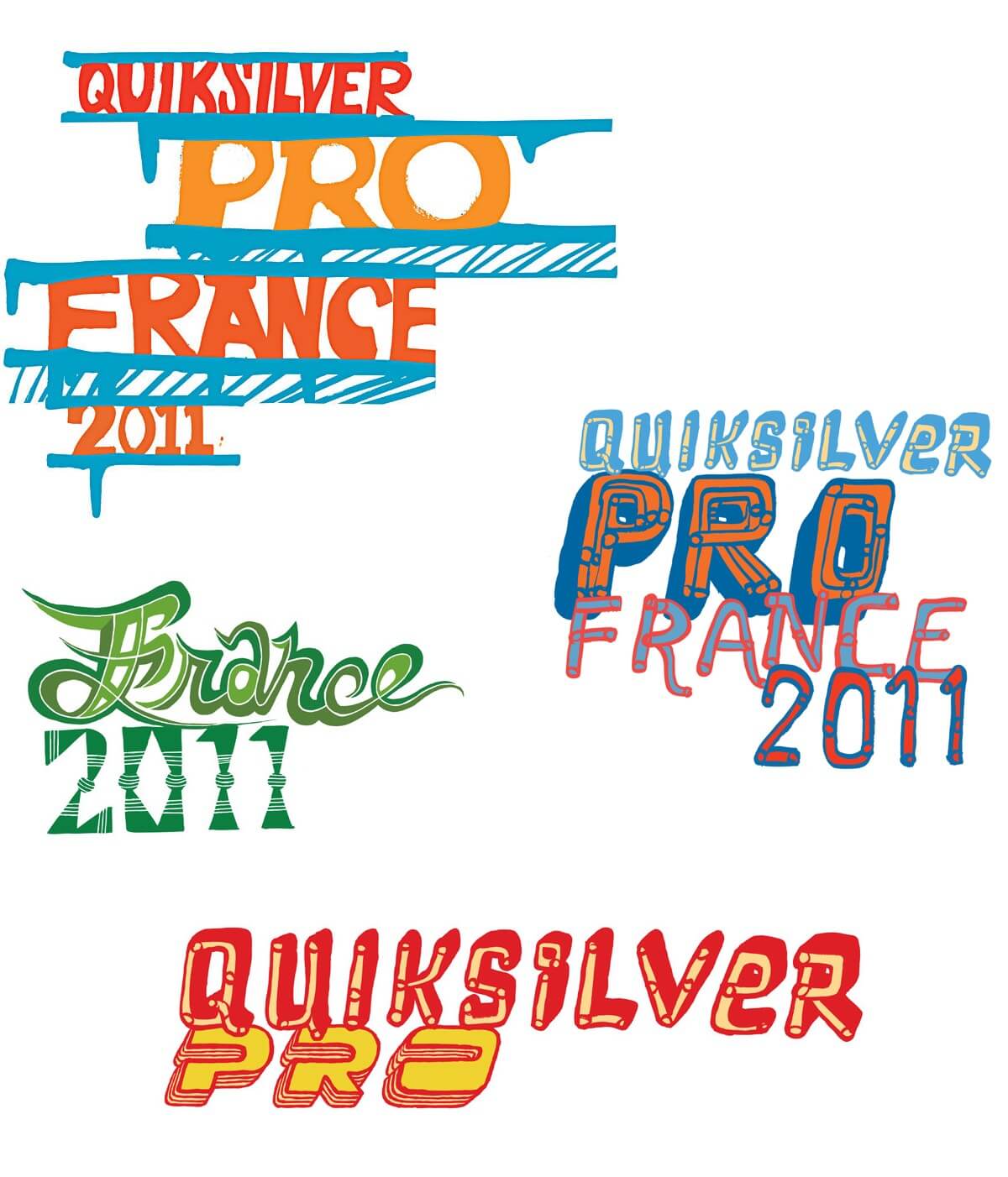
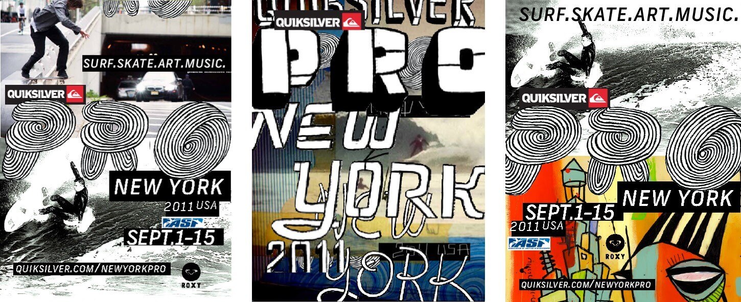
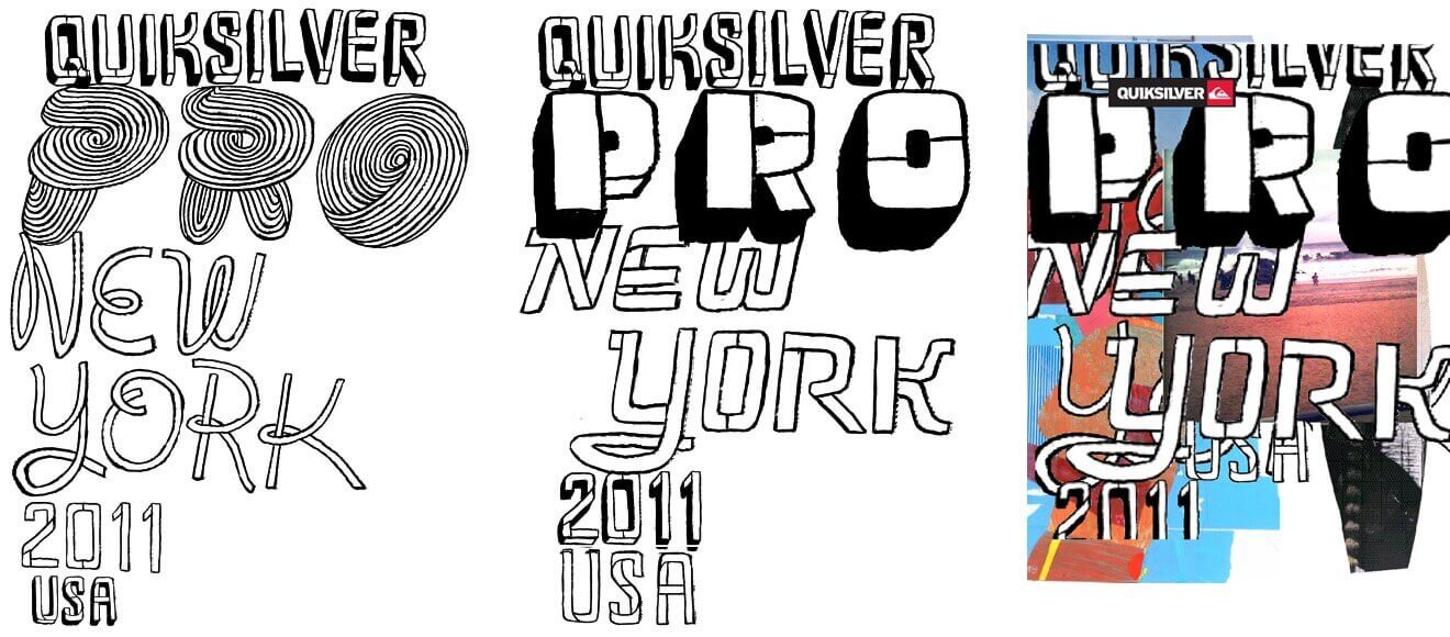
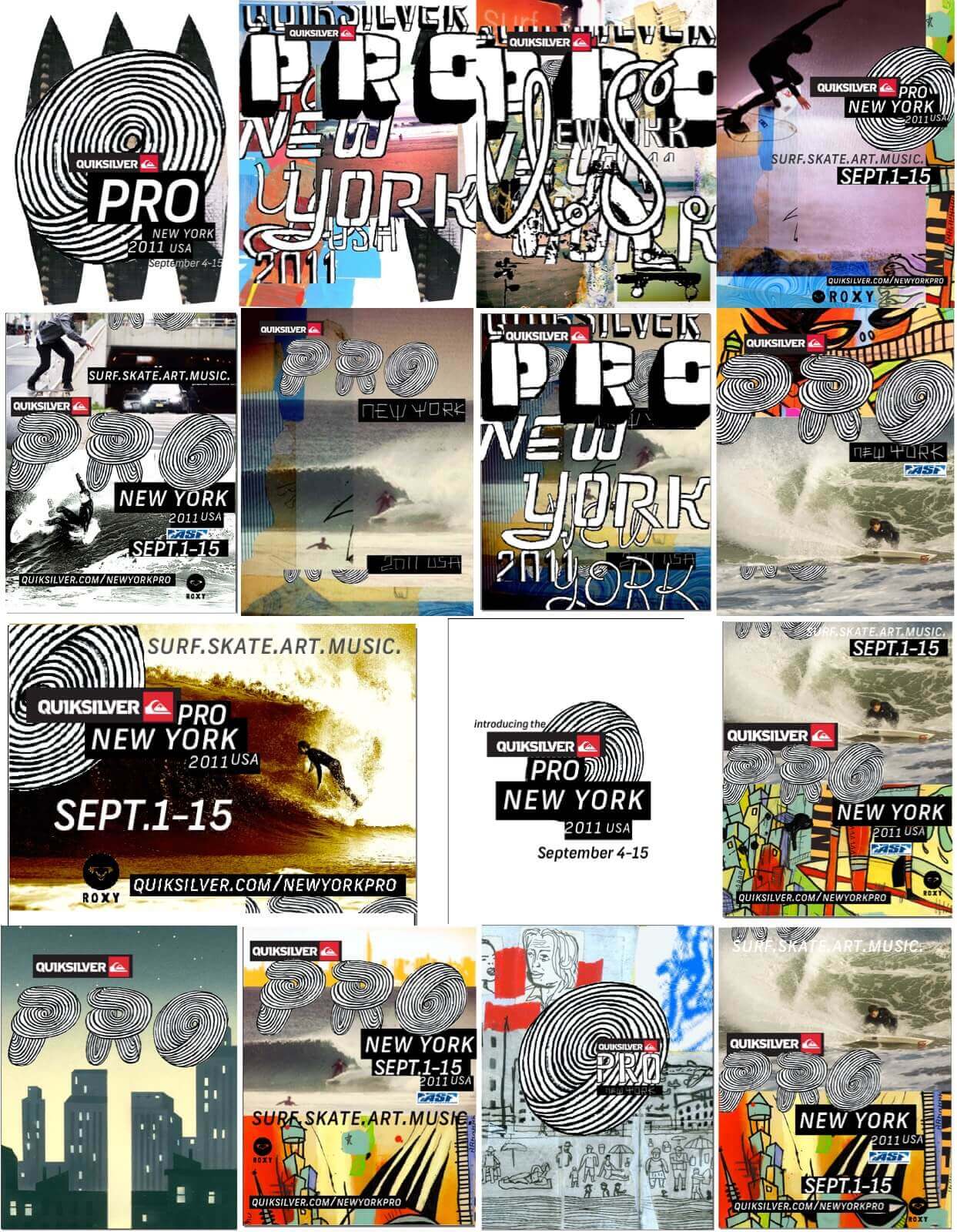
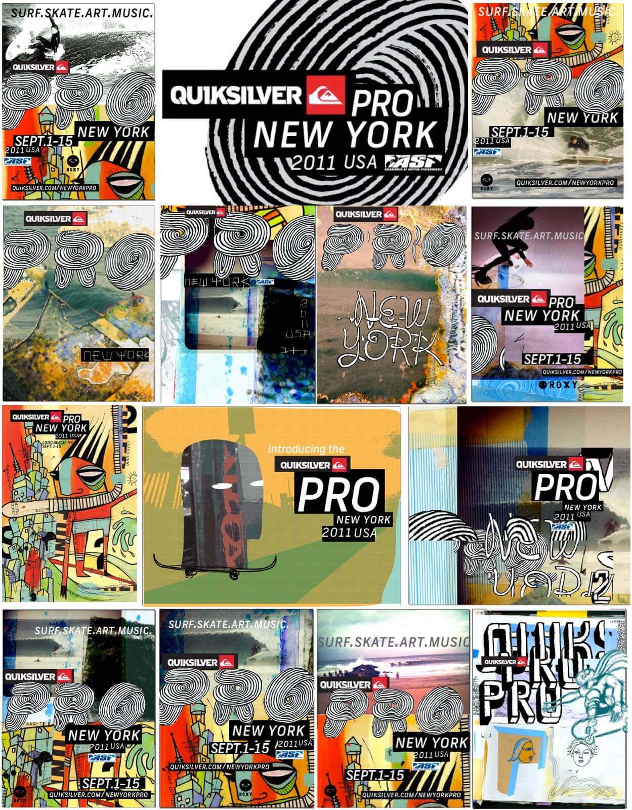
Quiksilver Pro New York concepts
Below is a sample of the collaborative explorations done for the design and art direction of the Quiksilver Pro New York 2011:
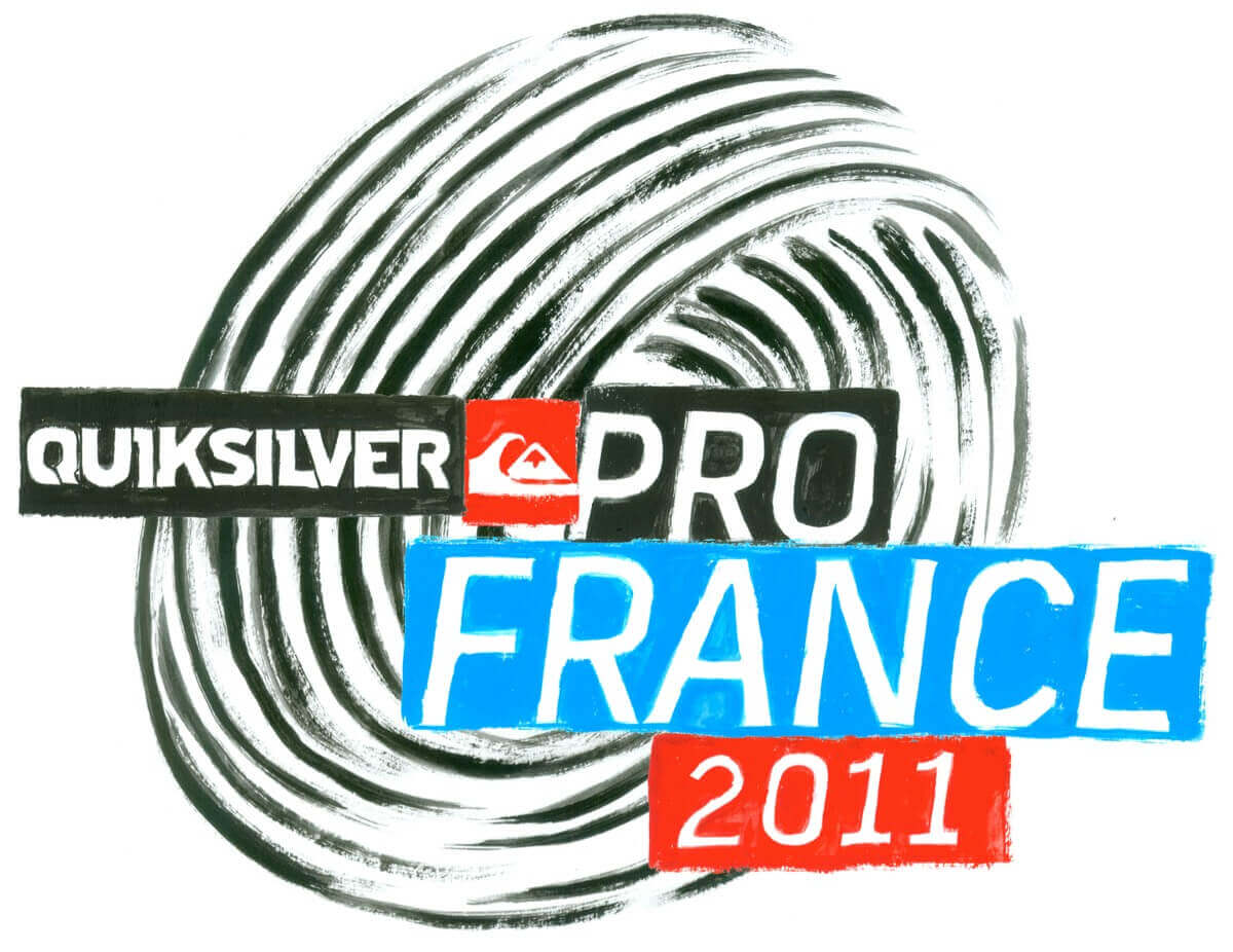
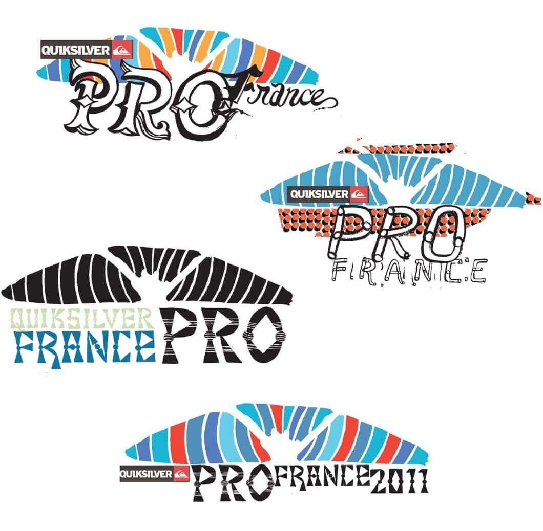
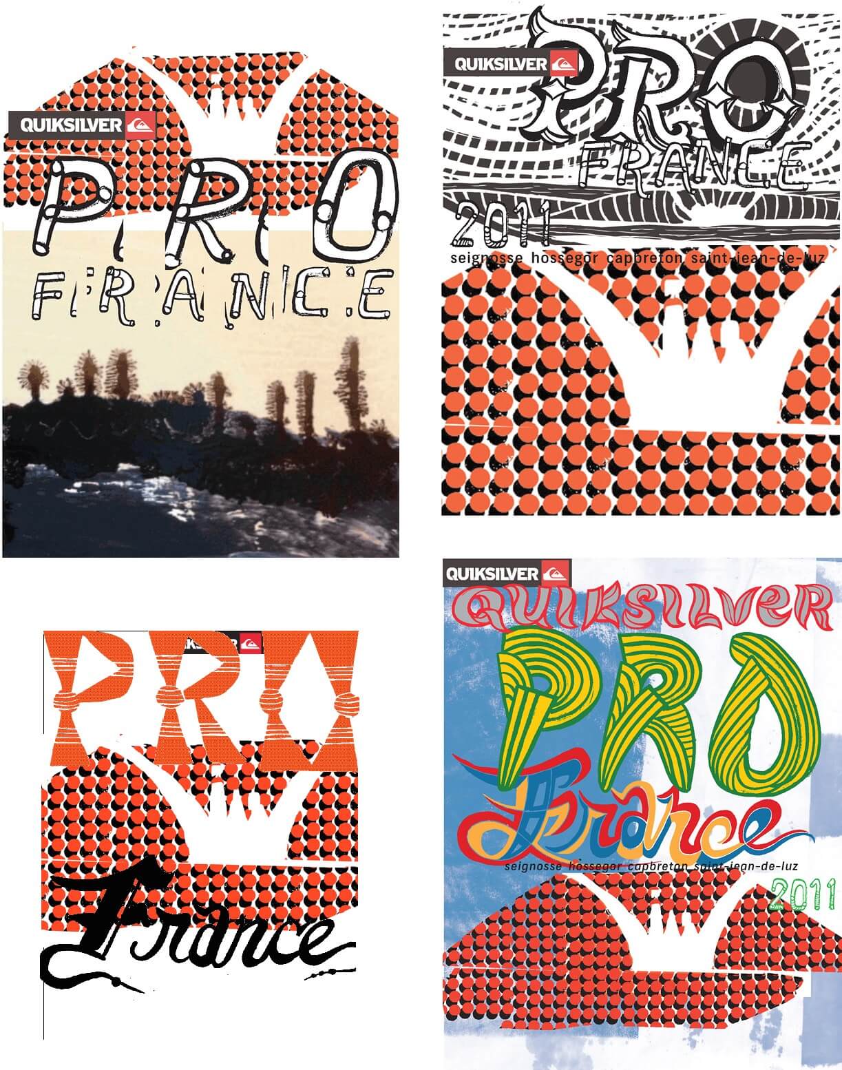
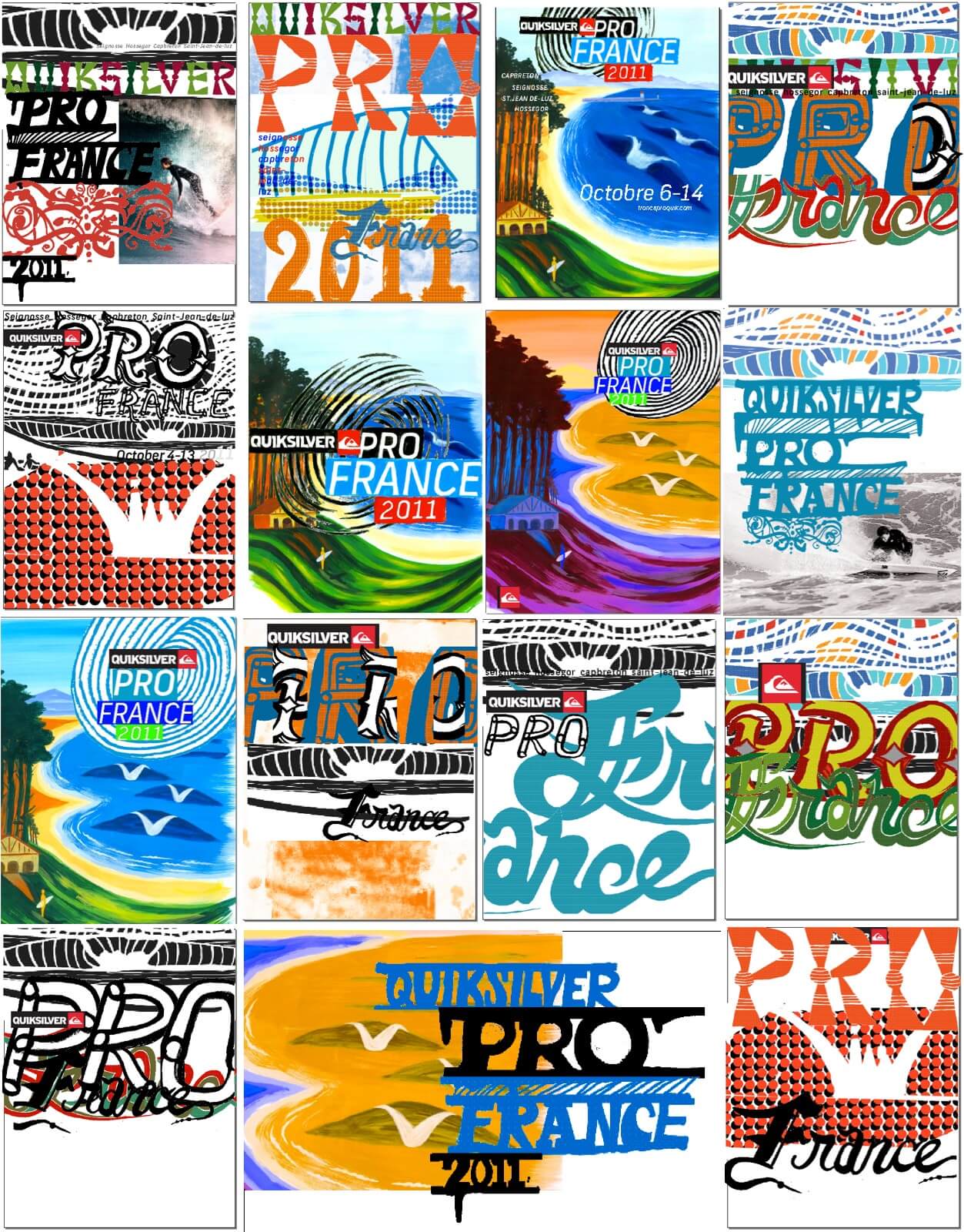
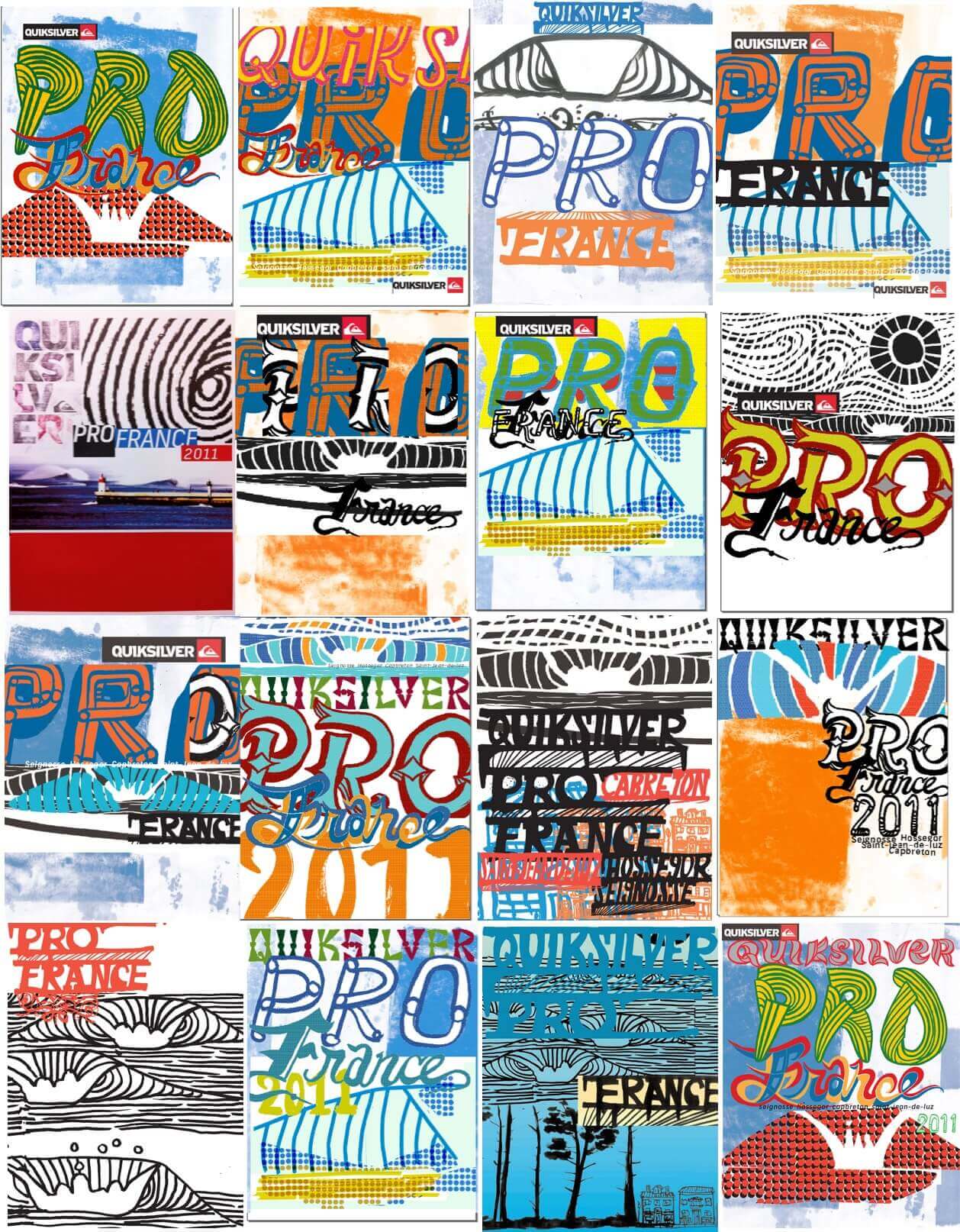
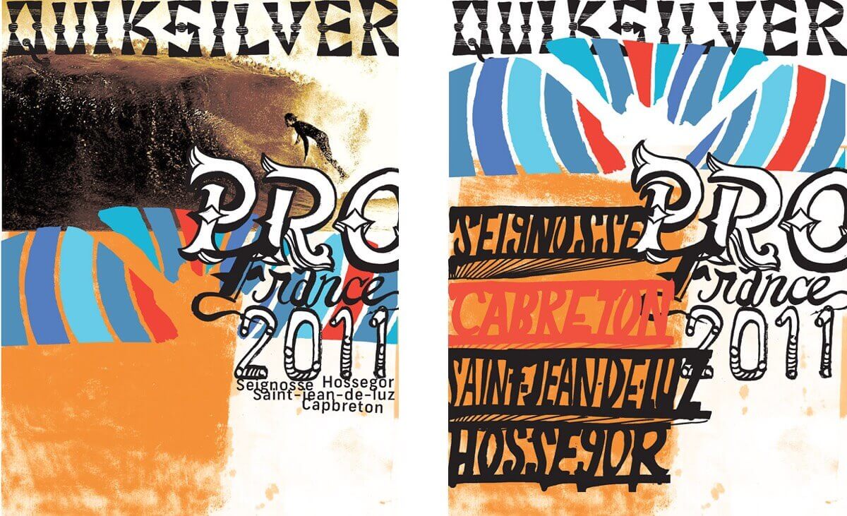
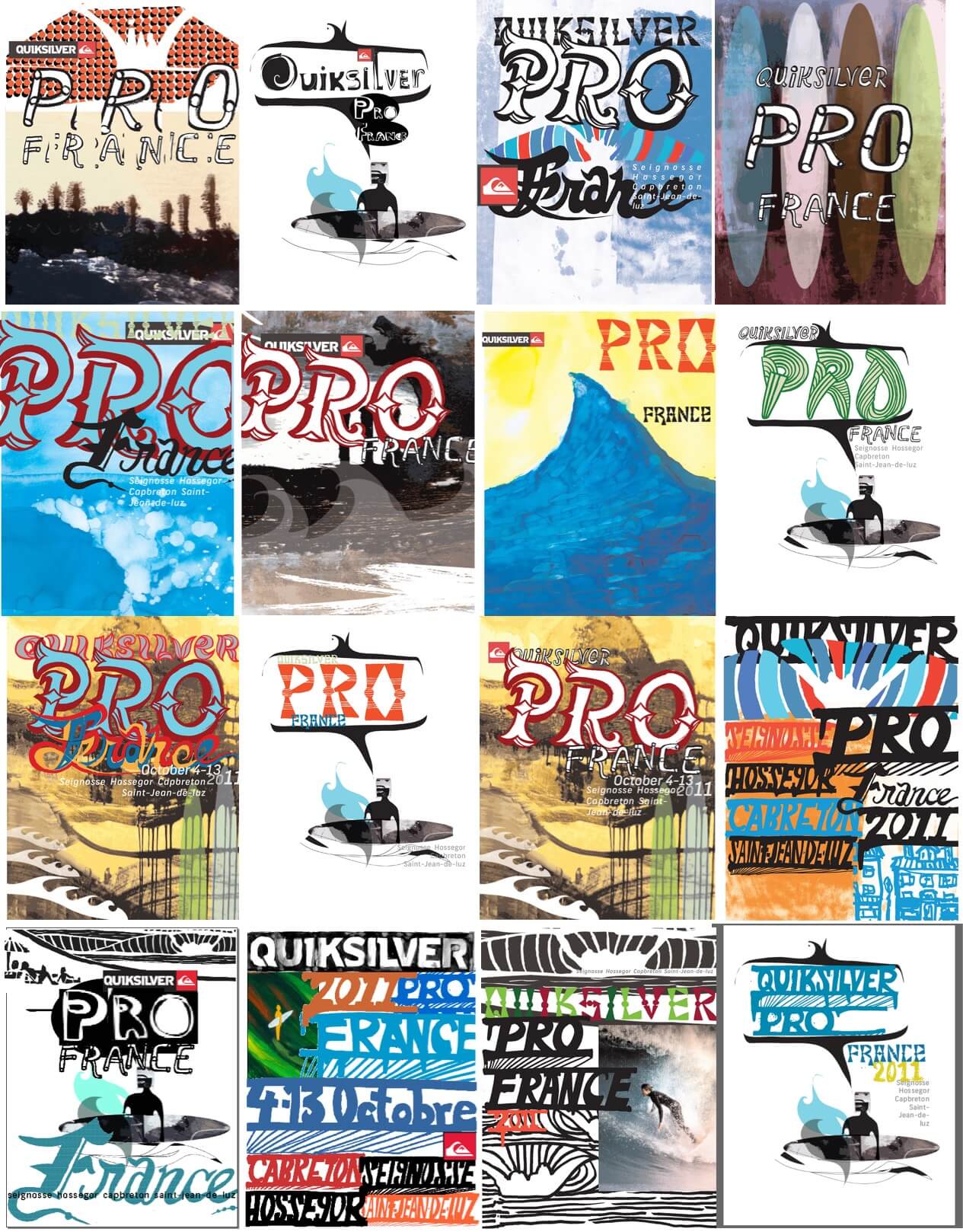
Quiksilver Pro France concepts
Below is a sample of the collaborative explorations done for the design and art direction of the Quiksilver Pro France 2011:
Curated by Andrew Couldwell on Sep 4, 2011