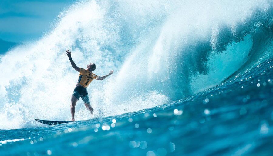
The Triple Crown of Surfing is one of the most coveted prizes in professional surfing. The annual event runs from November to December at three locations on the North Shore of Oahu, Hawaii. A tradition of the event — spanning back to 1983 — is to commission an artist to create original artwork themed on the event locations (you can see each year of the Triple Crown event artwork here). It’s considered an honour to be a ‘Triple Crown Artist’. And so we’re delighted to talk to the artist behind the 2020 Vans Triple Crown of Surfing event, Kate Wadsworth.
You were raised on the island of Oahu, Hawaii. Being a local, I imagine it was quite something to be involved in such a prestigious and historic event?
Absolutely! I’ve been a fan of Vans since I was a kid, and the Triple Crown of Surfing poster was at the top of my bucket list. For them to reach out and ask me to create the poster was a dream come true.
I was surprised to learn you were approached by Vans at the start of 2019 to create the artwork for the 2020 event (nearly 2 years later)… That’s a long time to keep quiet about such an amazing project! Can you talk about the process for a project like this…
Yeah, that was definitely tough to keep that to myself. Apparently, it takes about 18 months to get the merchandise produced, so they need the artwork completed fairly early on. The actual creation process, from brainstorming to painting, and all the correspondence with the team, really only took a month or two to complete.
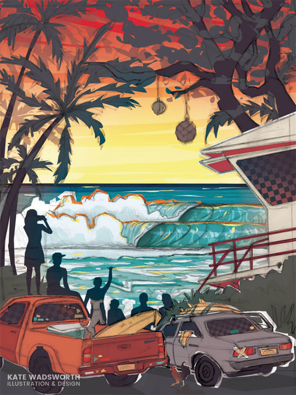
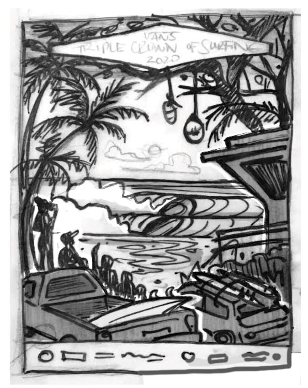
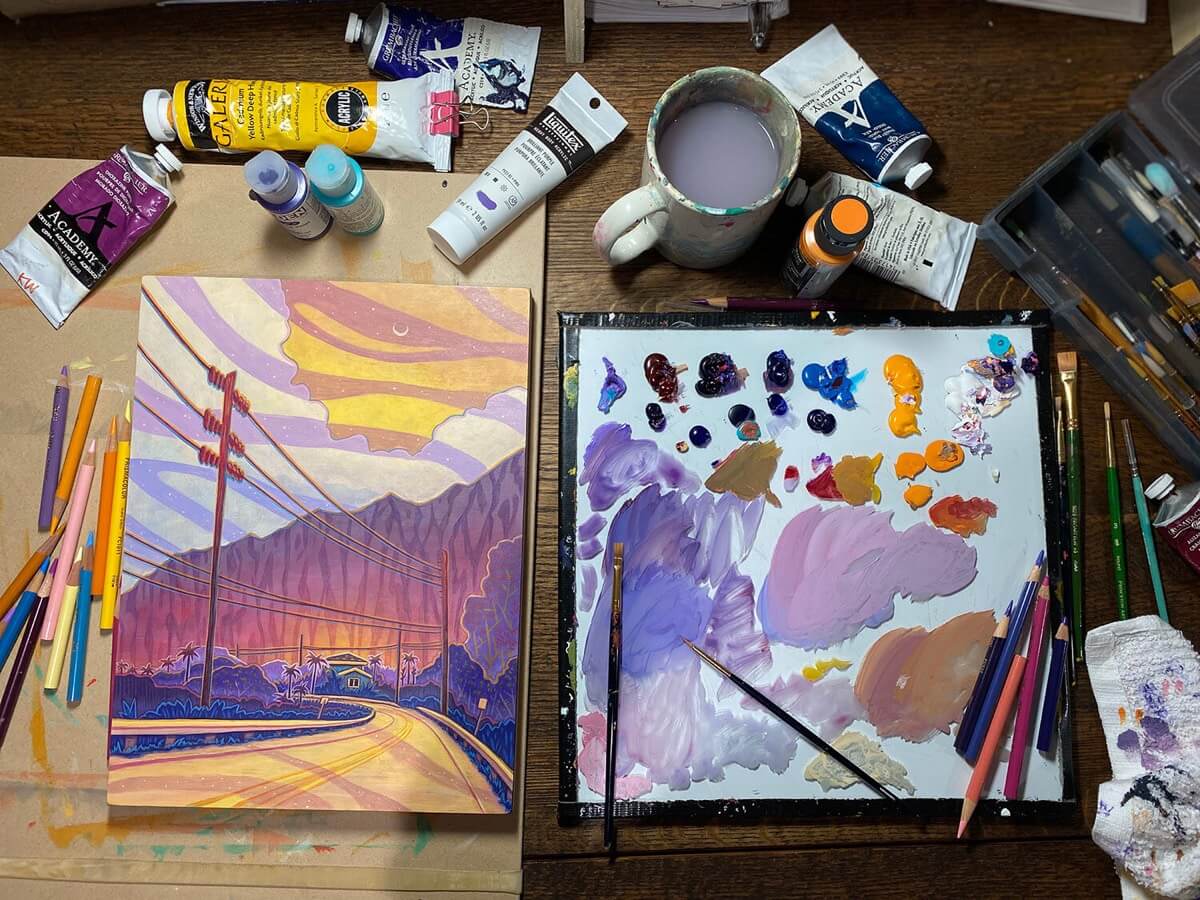
In a nutshell, my process was: Research trip and reference pics → brainstorm and concept sketch → final drawing and color study → final painting → logo and design = final poster.
Were you influenced at all by the previous years of the Triple Crown?
I tried my best to attempt something different from the previous years. The Vans Triple Crown of Surfing (VTCS) team gave me the general guidelines on what to include, but overall I was given a surprising amount of creative freedom. My goal was to portray more of the North Shore culture, rather than focus on a big wave or one surfer — which was a huge challenge because how do you create a poster for an awesome surf competition with anything other than an awesome wave or awesome surfer!
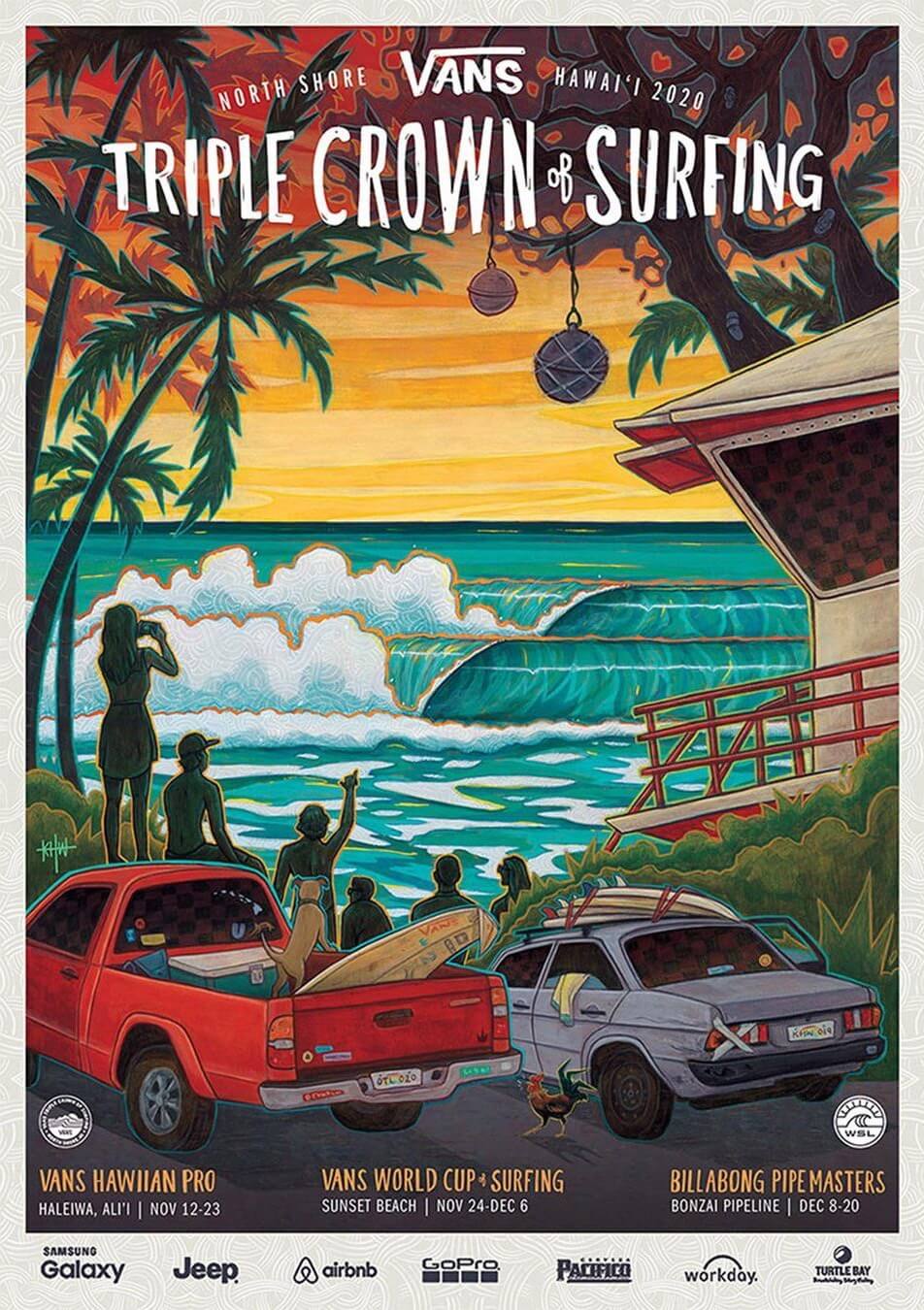
I was amazed at how much detail is in the event artwork! Things most people might miss on first view. Could you describe what you did, and your inspiration for the artwork…
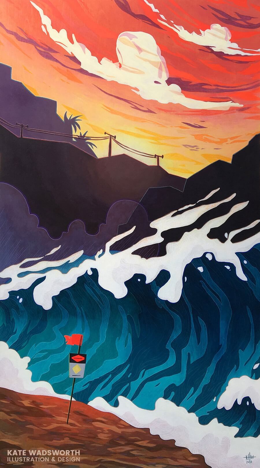
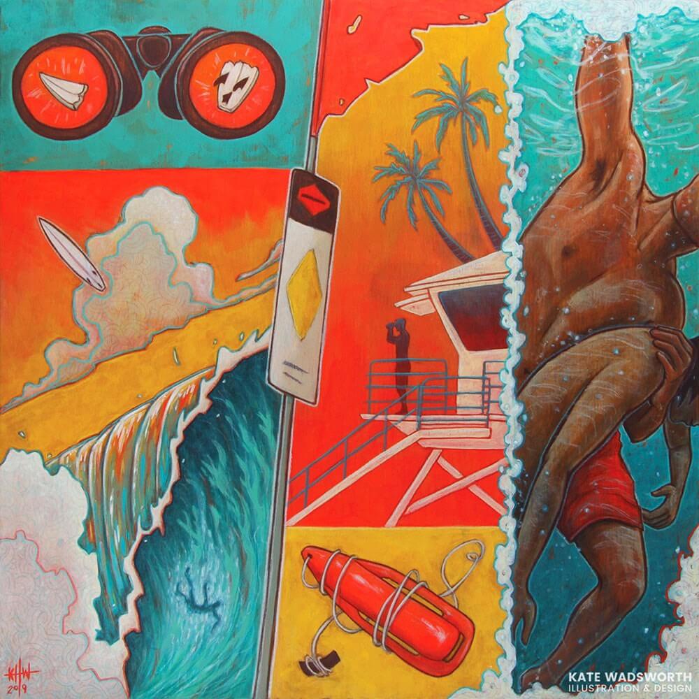
I took major design inspiration from the “high surf” warning signs that take up permanent residence along the beaches of Hawaii in winter. Like the signage, my illustration centers around a diamond shape that houses the infamous North Shore waves, vignetted by trees, spectators, local cars, and a lifeguard tower. All of the surrounding elements are a mashup of the three event locations: Haleʻiwa Aliʻi Beach, Sunset Beach, ‘Ehukai/Pipeline, (and even a little bit of Waimea Bay).
So much of the excitement of the competition comes from the spectators. Before Covid, the beaches were packed, but anyone could get a front-row view of the action. From a commercial standpoint, the artwork is something that can be printed on merchandise as a souvenir for both locals and tourists. From an artistic/personal point of view, it’s more of a love letter to the North Shore and the community that shares their backyard with so many people every year — especially the lifeguards and watermen/women that risk their lives every day (hence the large presence of the lifeguard tower in the poster).
Tell us about the triple crown easter eggs in the event artwork…
Early on I pitched an idea that included a little three-pointed crown icon above the Vans logo. We ultimately moved in a different direction, but I thought it would be fun to add a “Where’s Waldo” (aka “Where’s Wally”) element to the poster, and hid a number of little crowns throughout the composition. This would have been more entertaining had the big tents and event banners been printed, as you could have searched for them on-site, but Covid had different plans for public gatherings.
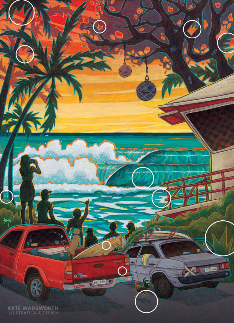
In addition to the crowns, there are a few areas that have a checkerboard pattern as a nod to the old school Vans aesthetic. The license plate for the truck is “OTL 020” for Vans’ new “Outside the Lines” positioning, along with “20” being the year of the competition. The license plate of the car is “KHW 019”, which are my initials and the year (“19”) when I actually painted it. My old pup, Max is hanging out in the back of the truck, and all of the bumper stickers and decals are winks at friends, family, and local Hawaii-isms you see every day here.
You also created the 2020 Vans Pro poster…
If I have it correctly, 2020 was the first year that Vans was taking over the sponsorship for the (previously) HIC Pro. I completed the Triple Crown poster about a year before the Vans Pro poster, but they wanted to use the same artist to do both. Because of the narrative elements of my Triple Crown poster, they asked me to create a pseudo-prequel for the Vans Pro, since the event is a qualifier for the Triple Crown. My concept for the Vans Pro artwork is a local surfer doing dawn patrol at Sunset Beach (the event location), either getting a quick sesh’ in before work or just getting there early to have the waves to himself. Maybe he’s a surfer/spectator later at one of the VTCS events? I made the poster colors unique enough to stand alone as its own poster, but complementary to the Triple Crown poster.
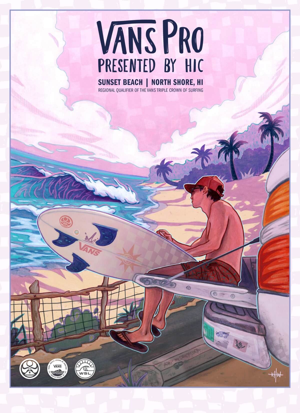
Note: The 2020 Vans Pro event never ran due to the Covid-19 pandemic!
You describe yourself as an illustrator and graphic designer. Tell us about your work, your style, what you love to do, and what kind of clients do you — or do you want to — work with?
The best part about freelancing is the variety of projects I’ve gotten to work on: event posters, logos, murals, apparel design, book covers, movie props… the sky’s the limit. The fun thing about posters and book covers is I get to flex both my illustration and graphic design muscles. This year, I’d really love to work on an editorial illustration for a newspaper or magazine.
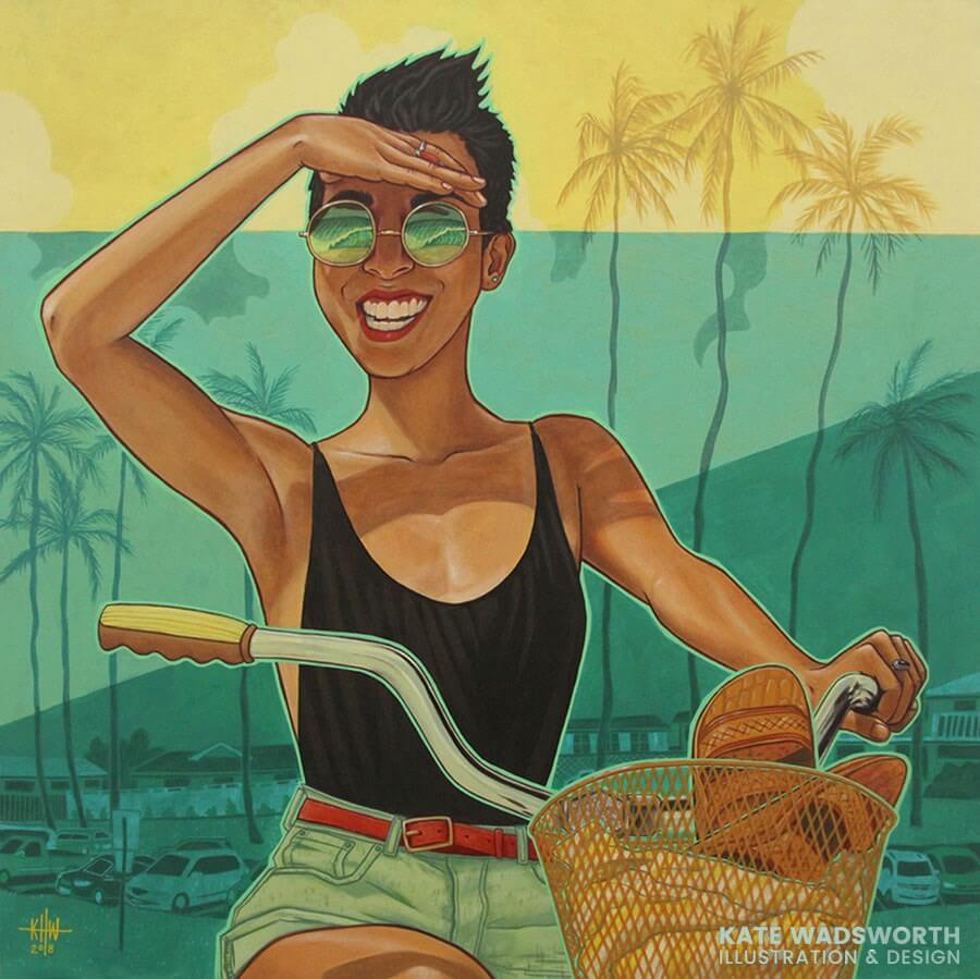
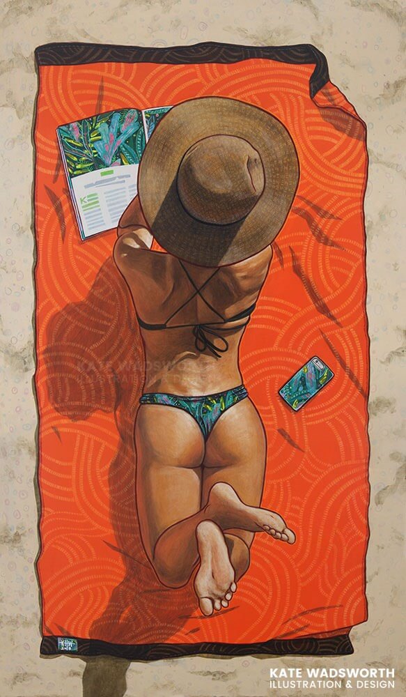
As far as style goes, I never know how to accurately describe mine, other than “illustrative”. I like to use a lot of big bright colors in my work. It never feels complete until I add a bold outline, and fill it in with some kind of subtle (or not so subtle) pattern, which I think is as much a stylistic choice as it is a meditation of sorts.
“Inspired by the natural world, Kate loves to experiment with bold colors, exaggerated shapes, and purposeful line work to tell stories with subtle but deliberate symbolism.”
What inspires the work you do? How do you decide what themes and subjects to explore in your illustrations?
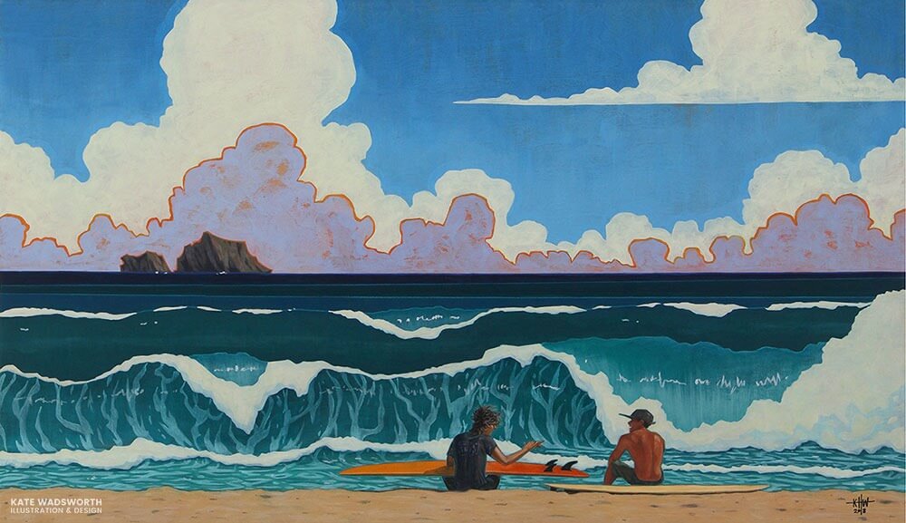
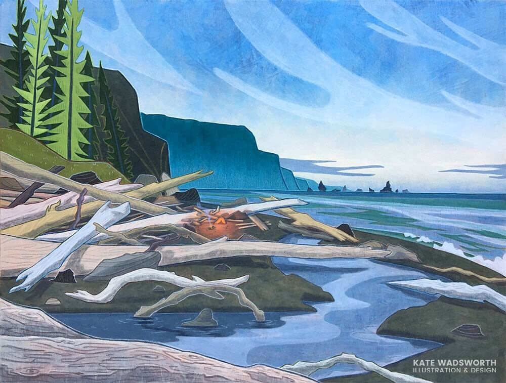
The boring answer is, everything, but I think my favorite thing to draw and paint are people. It’s fun to create fictional characters based on friends or people I know. While I’m out and about, I’ll take snapshots or make a quick sketch if I come across a scene or person that’s intriguing. Creating my own reference photos/material is an important part of my process. Lately, I’ve enjoyed highlighting, or at least actively including, mundane/everyday objects in my work (like power lines or garbage cans in landscape painting) — things that someone would probably edit out of an image because it’s considered ugly or distracting. I think those kinds of things give a scene character.
How does one purchase your art for their homes?
You can currently find prints of my work for sale on my Etsy: etsy.com/shop/katewadsworth
And finally, if I’m travelling to Oahu, where and what can’t I miss?
I’d suggest a sunrise hike on the east side, a tour of the murals downtown, a sunset on the west side, and of course the big waves on the North Shore. Smell as many flowers as you can, eat fresh poke, and don’t forget your reef-safe sunscreen (and a mask!).
Editor: See more of Kate’s work on her website: katewadsworth.com
Curated by Andrew Couldwell on Jan 6, 2021