Hey, Club of the Wavers! I’ve been threatening to do a tutorial of one of my paintings for years, and decided I better do it before I’m banished from the website! 😉
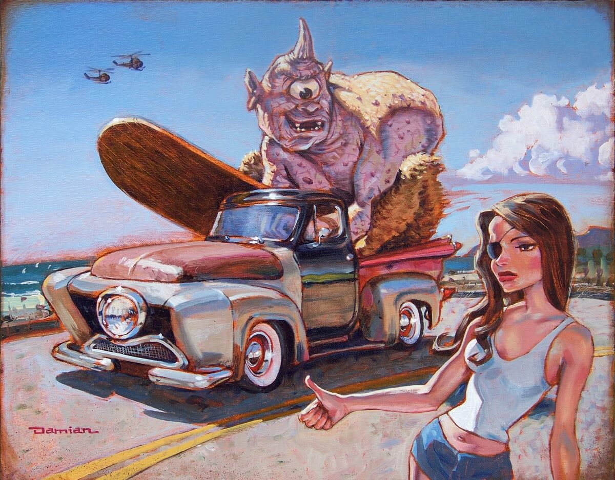
For the record, I have no business telling anyone how to arrange and apply pigment to make pretty pictures, especially since mine all kind of have an anti-beauty aesthetic. But if you’re the type that likes monsters, trucks, beaches, and babes, you’ve come to the right place!
1. The idea
I love to paint surf imagery, especially if there’s more to it than just a pretty wave. So before I blast globs of expensive paint haphazardly on a canvas, I want to know what the narrative is going to be about.

Sketch
The idea is everything, so when I came upon this little scenario, the moment a surfed out Cyclops discovers the one-eyed girl of his dreams… I knew this was my kind of story.
2. References
Once I have my idea, I want to confidently know where I’m going, so I hunt down references:

Truck
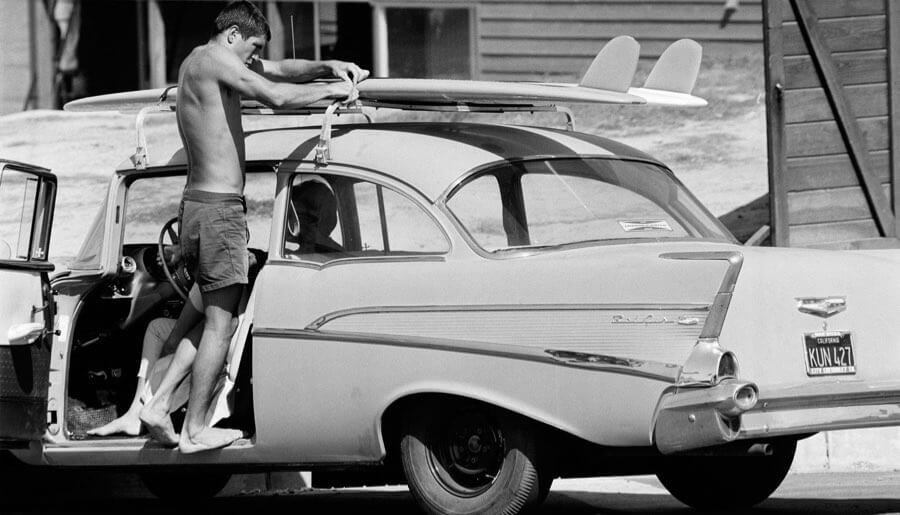
What kind of a vehicle would a monster drive and where would you find it? Local El Porto (California) surfer and antique auto restorer, Matt Harris drives this one of a kind Frankensteined truck. Bingo.

Light
Lighting will anchor these disperse elements together. Pick a light source and make sure all of your references — whether you shoot it, find it off the Internet, or make it up in your head — matches the lighting in the environment. This photo was shot right down the street from me and those are the Santa Monica hills in the background. I have no idea whose car that is.

Cyclops
My local zoo did not have a Cyclops so I made my son stand in. Notice how the lighting matches the previous reference I shot of the car. Love that maniacal expression.

Hitcher
Using my little thumbnail sketch as a guide, I directed my daughter, Grace to strike the pose of the unsuspecting hitcher. Doesn’t hurt to have good little actors around.
3. Tight drawing
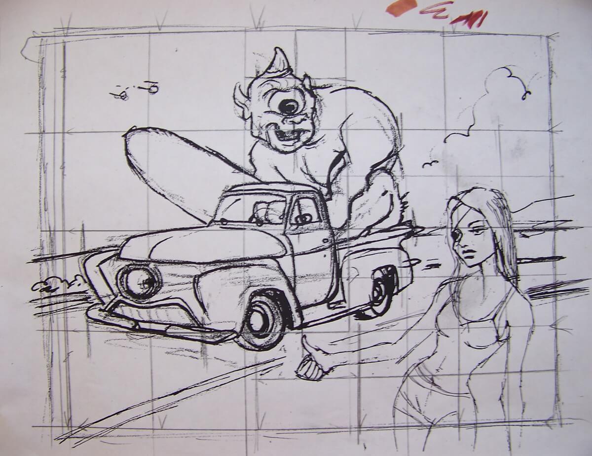
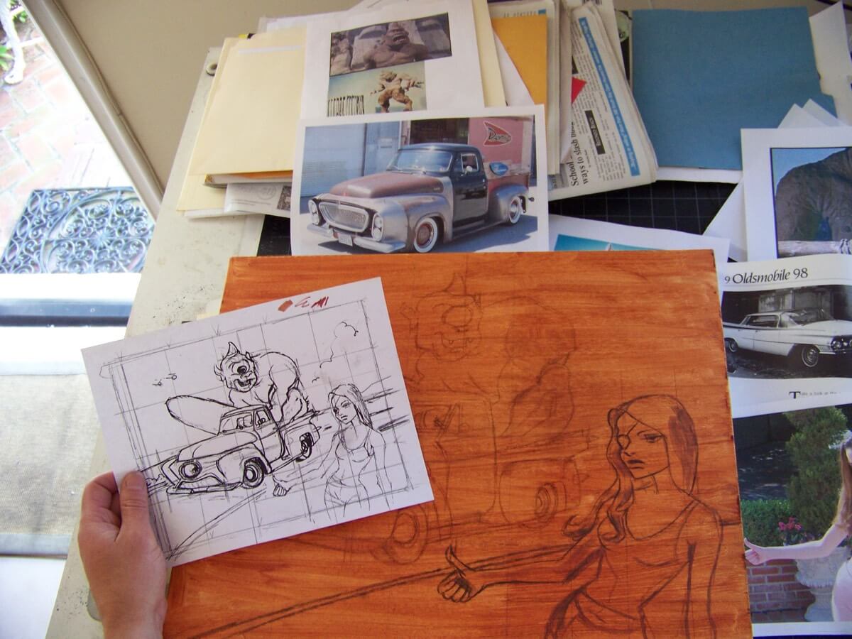
This is a tighter sketch that I’m using to figure out the composition and how it’ll fit on the canvas. I used to think a real artist should just wing it and go at it, painting directly on the canvas. That’s how Bugs Bunny always did it! But whenever I tried winging it, I found the uncertainty overwhelming and the flop sweat during the actual painting process unbearable. I’ve learned that if I prepare properly, I’m more confident and the painting process is much more enjoyable and intuitive.

4. Wash canvas
I use pre-stretched canvases because I’m lazy and would rather spend what little time I have (father of 4 kids!) actually painting. Here I used a burnt sienna wash thinned with odorless turpentine to cover the offensive stark white canvas surface.
5. Transfer to canvas
A classic grid technique helps me to pencil in the position of my subjects. You can see how I refine even further with the darker charcoal line. But hey, don’t be too slavish to your reference; otherwise, your stuff will end up looking like a collage. Go ahead and improvise. In this world, even the truck is a Cyclops!

6. Spray fix
Now I secure or “fix” the charcoal sketch by using a couple of thin coats of fixative (looks like a gratuitous product placement to me). If you don’t, the paint will pick up the charcoal and dirty up your color.

7. Sky-in
OK… showtime! Now I start blocking in big chunks of oil color. Premix your colors on your pallet or in little jars in advance, that way if you run out, you won’t have to match the color you’ve been using.

8. Break the image down
Break the image down to its basic shapes and fill them in. Putting cool colors next to warm tones gives the surface depth and energy.

9. Hitcher-in
Now I’ve blocked in the hitcher nice and loose. I’ll tighten up and detail later. Better to get the canvas covered and everything in place. This helps assure uniformity of execution and color relation. Whoa, did I just say that?

10. Light and tones
Remember the reference shot of my son? It’s showing me how the light wraps around shapes and defines the backlit subject. To create darks and lights of a color, a common rookie mistake is shading by adding black or white. Note the use of cool tones, like blue in the shadows and the warmer yellowish hues in the highlight. Now it’s starting to cook.

11. Drying
To speed dry stubborn oils, I use this little baking trick overnight so I can attack a fairly dry surface in the morning. Note to Editor: If my garage someday burns to the ground, please delete this before the insurance company sees this photo.
12. Adding detail
Now that all the shapes are blocked in and the big stuff is behind me, I love to just paint away and savor the detailing stage. This is my favorite part… the finishing touches. But I’m careful not to overpaint and finish to the level of photorealism for two reasons…
1. Detailing can be counterproductive. When a painting is too tight, all the spontaneity gets corrected out and those little unfinished gaps the viewer’s mind interprets are gone. The painting winds up feeling constipated, losing its zeal and fervor. And so do I.
2. I like the paint to appear like it simply splashed its way onto the canvas, sort of spontaneous and willy-nilly. Looks confident and reflects a devil may care, artsy-fartsy attitude, like John Singer Sergeant or Monet — and those guys are fancy schmancy painters!

Final thought
One final thought. Sometimes a title makes the idea all that much more profound… or at least entertaining. I originally was going to call this “Made for Each Other”, but I found out I already used that title for a different painting! The Bible verse, “An Eye for an Eye” came to mind and it became the single focus and stuck… get it? Single focus… Cyclops? Never mind, go paint something brilliant.
Curated by Damian Fulton on Sep 19, 2010
